Journey of Hope Web Redesign
Role:
UX Researcher & Design
Team:
Nayani Ramirez- UX & UI Research
Mandy Johnson- Team Lead
Tressa Parkes- UX Research & UI Design
Ronaldo Ramos- UX & UI Design
Anna Figueiredo- UI Design Lead
Claire Philippides- UX Research Lead
Date:
August 27, 2024
Journey of Hope is a non-profit organization that supports domestic violence survivors. By doing so, they provide essential resources such as shelters, educational courses, workshops, and a variety of options aimed at empowering healing individuals affected by abuse. In addition, they also offer opportunities for volunteers and donations, encouraging community engagement to further their cause. Our mission was to make a redesign of their existing website. We achieved this by enhancing accessibility and usability. By prioritizing the needs of our target audience, we aimed to create a user-friendly platform that makes it easier for survivors o access vital resources d for supporters to contribute through volunteering and donations.
Issues with the current site:
Lack of content hierarchy and prioritization
Unclear site navigation and mapping
incosistent brand identity
Desired Impact:
Upon redesign we are aiming to create a site with more engagement making it easier for users to find resources and volunteer opportunities.
Metrics to Success:
Increase of volunteer sign-ups
Reduced confusion and information overload
Facilitation of easy access to donations and resources.
The challenge:
Users struggle to find volunteer or donation opportunities due to disorganized websites.
Unclear mission statement and having trouble identifying legitimacy.
User Insight:
Users want the NPO’s impact and values to align with their own.
User needs information that fosters authenticity and credibility.
Key Findings:
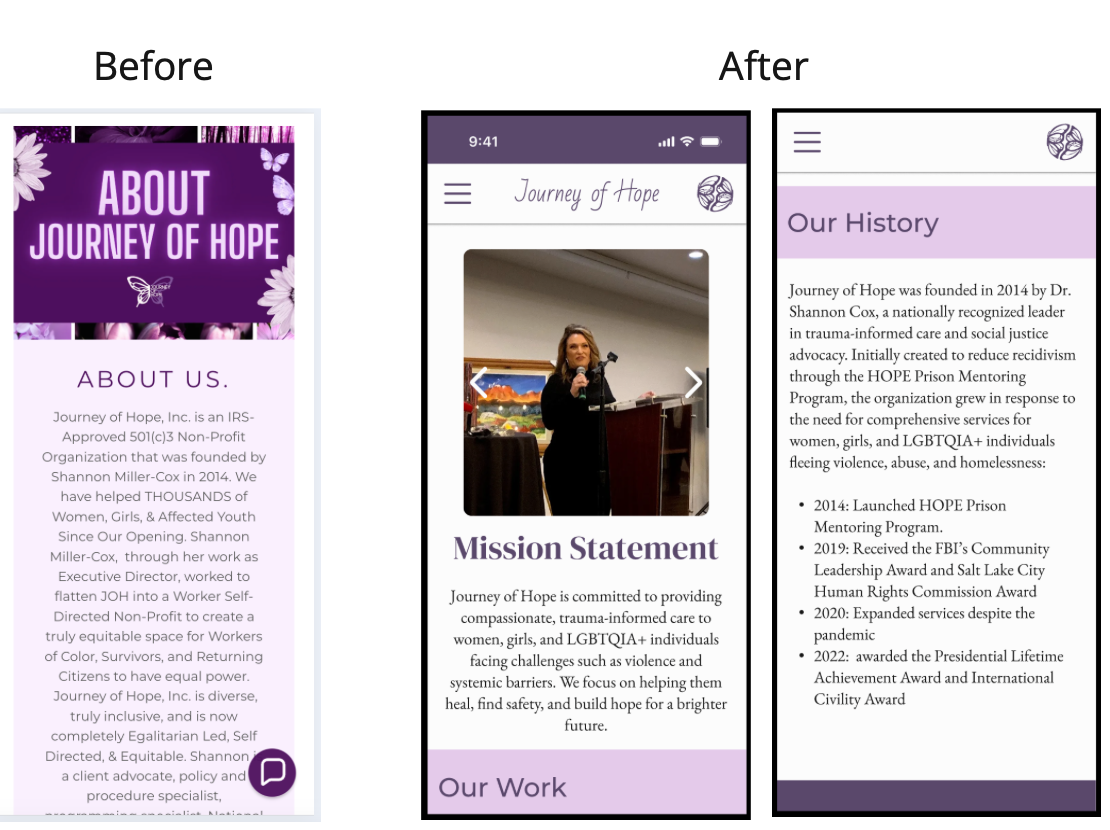
Content was overwhelming and difficult to scan, with too much text and little visual hierarchy.
Key actions like donating or seeking help were hard to find or not emphasized.
The site lacked trust-building elements like testimonials, stats, or partner logos.
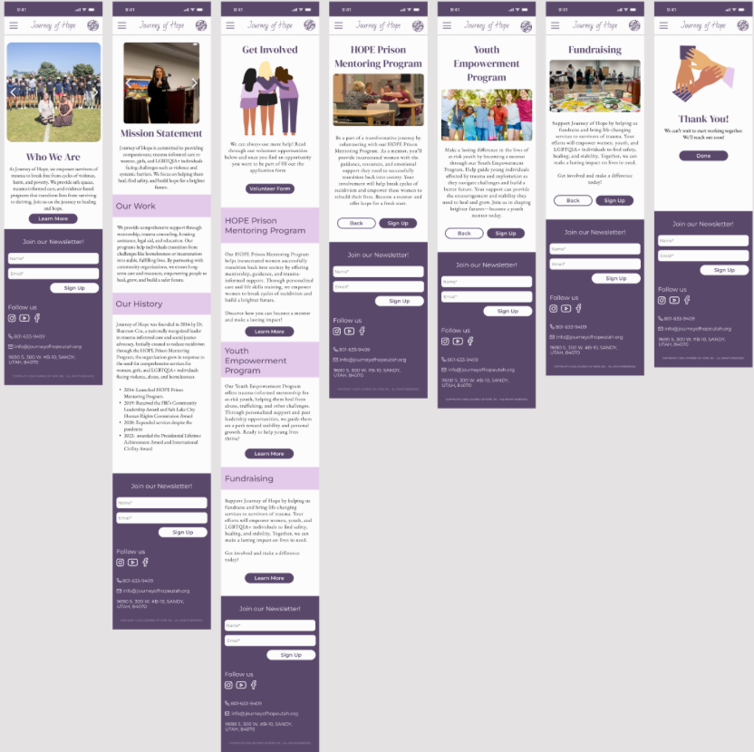
Outdated design and poor mobile optimization hurt usability and engagement.
Background:
Journey of Hope supports vulnerable populations, including previously harmed women and girls aging out of state systems, LGBTQIIA+ individuals, survivors of domestic violence, sexual abuse, and human trafficking, as well as those transitioning out of incarceration. Clients often face urgent needs such as food, clothing, housing, mental health support, and personalized case management. The redesigned site aims to present this information clearly and compassionately, while also making it easier for users to take action — whether seeking help, donating, or signing up to volunteer.
Survey Results:
84.6% of participants supported an NPO because they had a personal connection to the cause.
69.2% of participants reason for supporting was because of the evidence of success.
About 30% of people support NPOs outside of their community.
39% of people always or almost always only support NPOS in their community.
65.4% of participants prefer to donate money to NPO’s.
57.7% of participants prefer to find volunteering opportunities.
Less than 50% prefer to provide services (34.6%).
Less than 10% prefer to donate other goods (3.8%).
The most common ways for participants to find NPO’s to engage with is through family and friend recommendations (57.7%) and online search (50%).
17 out of 26 participants found NPO’s to support through more than one channel.
Key Insight:
People are most motivated to support nonprofits they feel personally connected to and that show clear impact. Most prefer to give money or volunteer locally, and they typically discover organizations through trusted referrals or online search.
Brainstorming Summary:
Information Architecture:
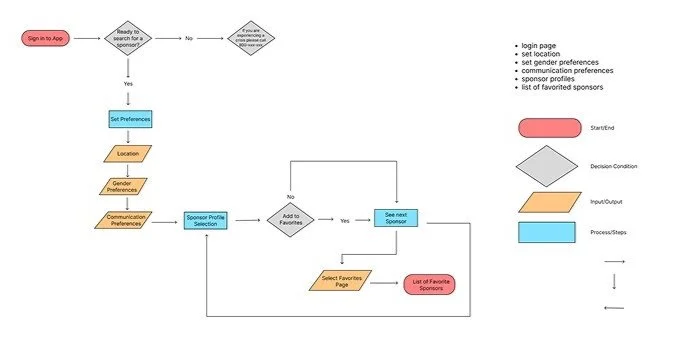
User Flow:
We discovered there were lots of ways users could find the information that would lead them to support JOH.
We decided to focus in on the path we thought most would take due to the information gathered through our research.
We chose to focus on the end result being users signing up to volunteer.
Lo-Fidelity Mockup:
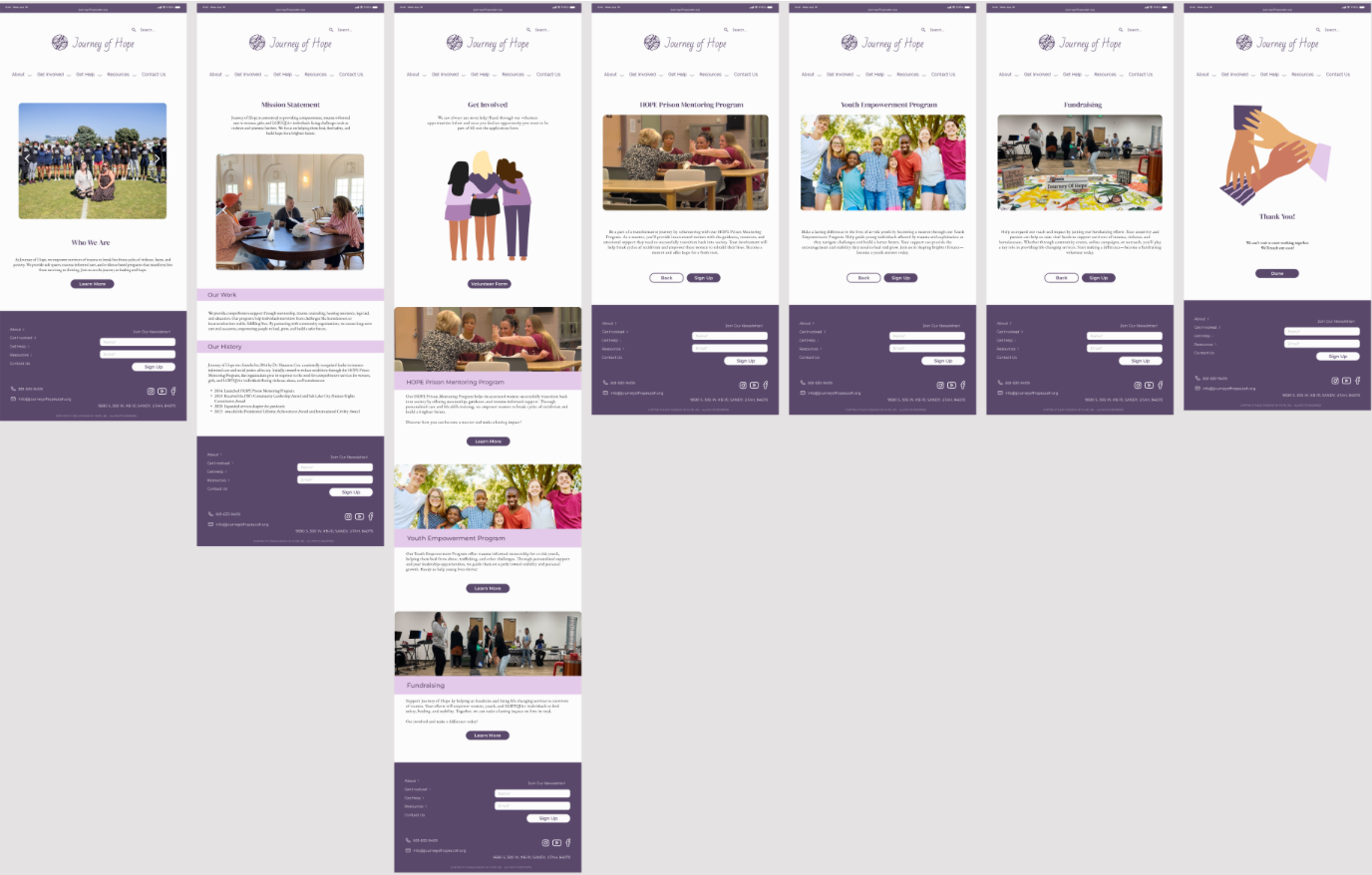
The low-fidelity prototype effectively demonstrated the core functionality and user flow of the platform, focusing on intuitive navigation and task completion. Overall, users responded positively to the simplicity and clarity of the interface.
What Worked Well:
Easy to use navigation: Users were able to move through the interface with minimal confusion.
Quick access to information: Most users could easily locate the information they were looking for.
Straightforward sign-up process: The sign-up flow was clear and efficient, with users completing it without issues.
Identified Pain Points:
Lack of descriptive body text: Some users found it difficult to fully understand certain elements without accompanying explanations or context.
Misleading clickable areas: Many users attempted to click on the volunteer opportunity titles (which were not linked) rather than the images, indicating a mismatch between user expectations and functionality.
Missing navigation options: Users expressed a desire for a back button on each opportunity page, suggesting the need for more flexible navigation.
High-Fidelity Mockups:
Before and After
Tablet
Mobile
Visual Design
Wire-Frames
User Research Plan
Redesign Introduction
What I Learned?
Working on the Journey of Hope redesign deepened my understanding of how critical content hierarchy, accessibility, and trust-building elements are when designing for nonprofit audiences. I learned how user-centered design directly impacts engagement, especially for users in crisis or those seeking meaningful ways to contribute.
Collaborating in a multidisciplinary team sharpened my communication and facilitation skills, especially when synthesizing complex research findings into actionable design solutions. I also gained valuable experience iterating based on user testing feedback, such as adjusting navigation and clarifying interaction cues to match user expectations.
Most importantly, I learned how design can build empathy and reduce barriers for vulnerable users — reminding me that inclusive, accessible design is not just a feature, but a necessity.
What’s Next?
If given the opportunity to continue, I would recommend implementing usability testing with real Journey of Hope stakeholders, especially survivors and volunteers, to gather deeper behavioral insights. Their lived experiences would inform additional refinements to tone, visuals, and content prioritization.
Future enhancements could also include:
Building out multilingual support for underserved populations.
Adding live chat or emergency contact tools for users in immediate need.
Creating a performance dashboard for the NPO to track engagement and donor activity.
Additionally, a plan for maintaining content consistency and accessibility standards would ensure long-term success of the redesigned site.
Outcome and Impact
Desktop
The redesign provided Journey of Hope with a modern, streamlined platform that aligns with their mission and better serves their audiences. By clarifying navigation, emphasizing calls to action, and integrating trust signals, the new site removes friction for users seeking help or wanting to contribute.
While metrics are pending full deployment, early user testing revealed:
Increased ease of finding donation and volunteer opportunities.
Clearer communication of the organization’s mission and values.
Reduced confusion and improved mobile accessibility.
Our work has not only elevated the organization’s credibility online, but also created a digital space that feels safe, empowering, and inclusive — which is essential when serving survivors of trauma.
The Problem
The organization’s existing website lacked a user-friendly, accessible design and failed to effectively convey its mission and services. Visitors struggled to navigate the site, which led to confusion and frustration, hindering potential clients and supporters from engaging with their offerings. The website's outdated layout and unclear content also made it difficult for users to find critical information, donate, or get involved with the organization.
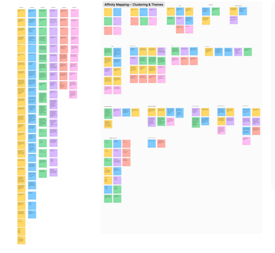
Research and Insight
Brainstorming and Ideation
Easy to find information and resources
Clear values & mission statement
A list of ways to support the NPO
Trust and Legitimacy: Users struggle with verifying NPOs’ legitimacy due to poor online presence or unclear information, which leads to disengagement.Overwhelming Choices: Information overload makes it difficult for users to identify relevant causes, leading to decision fatigue.
Personal Relevance: Users are more likely to engage when NPOs align with personal interests or past experiences.
Barriers to Action: Unclear paths for volunteering or donating, and inaccessible websites create friction, discouraging potential supporters from engaging.
Design Process
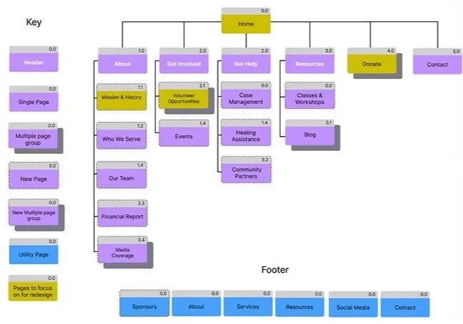
Based on the research that was conducted, we created an intuitive flow that would simplify the user journey and reduce decision fatigue:
The main navigation includes: Home, About, Get Involved, Get Help, Resources, Donate, and Contact.
The About section includes Mission & History, along with new pages for Our Team and Community Partners.
Get Involved offers users ways to engage through Volunteer Opportunities and Events.
The Get Help section provides access to Case Management, Healing Assistance, and Classes & Workshops.
Resources includes Who We Serve, Community Resources, and a Blog to share insights and updates.
The Donate section allows users to contribute and view the organization’s Financial Report.
The Contact page features general inquiries and Media Coverage as a utility page.
The footer includes quick links to Sponsors, About, Services, Resources, Social Media, and Contact.


